We’ve done lots of them, at home and abroad, for various reasons including Mike’s work, medical trips from Outback towns to major centres, look-see rubber necking, to visit friends, attend the odd wedding, for tourism and vacations, plus one notable epic trip overland Mt Isa to Kalgoorlie, moving house but unable to fly across because of one offspring being post ear surgery… a fantastic outback journey out through Winton, Longreach, Cunnamulla, Wilcannia, Bourke, Broken Hill, Adelaide and across the Nullabor to Kal.
 Ticket to Munmalary 1997, 150cm x 130cm, (photographed against yellow)
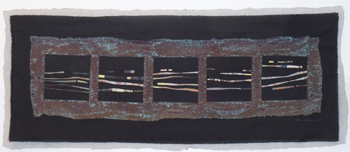
Through road trips I have seen and experienced a reasonable portion of the world – huge areas of Outback Australia including the wilds of Tasmania our home state, quite a bit of the southern part of South America, large tracts of North America and a little of Europe. I’ve normally been in the front, either driving or on the passenger side. Other times I have hurtled through a landscape to somewhere on a bus, with a particular sensation of looking sideways and seeing things slip by, which prompted Ticket to Munmalary, years after our Tent Period. You can’t get to Mummalary by bus – or back in 1975 couldn’t anyway and I doubt things have changed much. It’s an isolated cattle station out in the Alligator Rivers area of NT, on a dirt road punctuated by wide buffalo wallows, requiring a 4WD with experienced driver. My memory of going out there for the first time was a passenger seeing an unfamiliar landscape that sort of flashed by in glimpses, like an old movie.
I don’t have the same sensation sitting in the front of a vehicle and able to see the road ahead. This different sensation led me to do a series of little roadscapes a few years ago I called Road Trip #1, #2... and so on. They are about 15cm x 20cm, mounted in some brushed aluminium frames, and I think there are about 20 of them in storage in Australia. These were fiddly but fun to make, and each was loaded with memories of road trip experiences.


C
Like this:
Like Loading...